

 Farmers create coloured rice 'murals' in Japan [more at telegraph.co.uk]
 Money Maker
Never worry again.
Impress people.
Quit your job.
Live your life.


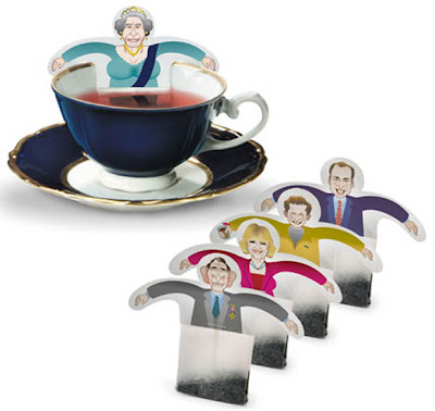
 Love this German design company Donkey Products humorous products. Interesting and funny tea bags. Check out the other designs here.


 "Bad food, bad dog. All the vitamins, all the flavor."
Advertising Agency: Prolam Y&R Santiago, Santiago, Chile
Executive Creative Director: Tony Sarroca
Regional Executive Creative Director: Guillermo Vega
Creative Directors: Francisco Cavada, Alvaro Becker
Art Directors: Fabrizio Capraro, Andres Echeverria
Digital Retoucher / Illustrator: Raul Pardo
Account Supervisor: Juan Carlos Meza
Published: April 2009


This project to us is a platform to establish a critical dialogue within our built environment; to raise questions as much as it is to finding solutions. The project is a critique on our cultural attitudes and how we determine them. A critique on what we consider to be of heritage significance and how to narrate such ideas in a critical and contemporary manner.
This once vacant site is nestled at the eastern bookend between a row of single fronted Victorian terraces and a double fronted Edwardian weatherboard house.
Our strategy was to critique and respond to our ongoing research into the Terrace typology. The built form is essentially an urban infill within a 5.5×14.4m envelope. The perforated house is our response to establish an alternative language to the accepted notion of our cultural attitude towards critical questions of identity and heritage.
We wanted the house to be more than just a facade. More than just a message or a graphic stuck to a building. Our building was not an urban canvas paying tribute to Venturi’s “decorated shed”, instead the external facade could be experienced internally and is also a multi functional device that constantly transforms the built form from solid to void, from private to public, from opaque to translucent. By day the building is heavy and reflective and by night inverting into a soft translucent permeable light box. The operable wall or the absence of the facade enabled us to remove the idea that houses are static.
The use of operable walls, doors, curtains and glass walls enables the occupants to change the experience and environment. This architectural manipulation of space blurred the boundaries between inside and outside, the public and private realm. The manipulated spaces overlapped and borrowed the amenity and context of it’s surrounding environment.
The plan inverts the traditional terrace program with the active living zones on the first floor opening onto a north facing terrace thereby generating a primary northerly orientation to a south facing block. The perforated house incorporates passive sustainable interventions by orientating north glass bifolds doors and louvers for cross ventilation as the primary means of cooling. In addition, solar hot water and 5 star rated sanitary ware fixtures were incorporated. The north facing terrace redefines the “aussie” backyard reinforced by the childlike mural reminiscing on a past era and making commentary on the changing demography of the family unit and ultimately the inner city house typology. (via contemporist)


 Some wonderful work being done by LA-based artist Paul Lee, which I came across on Ffffound a few days ago.Check out more of Paul’s inspiring work on his website.


 Artists Alexandra Zaharova & Ilya Plotnikov delivered an idea more enthralling than the jewelry it was intended to promote. Their Paper Sculpture designs framed the model in pure, geometric white fashions with a bold black tie front-and-center. Their portfolio is rich with paper-styled designs. [zaharova x plotnikov on behance]